The Great Depression wasn't the worst. Assuming a yearly withdrawal rate of 4.5%, yearly adjusted for inflation, a portfolio invested 60% in S&P 500 and 40% in government bonds starting in 1929 would have survived for 30 years. The same portfolio starting in 1966 ran out of money. I think this is remarkable. But what's also remarkable is that 92.8% of all such 30-year retirement cohorts starting from 1871 succeeded, with most ending up wealthier than they started. Using 150 years of actual market data, we can see exactly which rare cohorts failed, which barely survived, and the surprisingly small tweaks that separated disaster from success.
The difference between complete portfolio failure and comfortable success often comes down to retiring a few years apart. With the same investment and withdrawal strategy you can end up with completely different outcomes.
To test this we set up a simple scenario across 125 different 30-year periods starting from 1871 to 1996: $1 million starting portfolio, 60% stocks (S&P 500 for this post), 40% bonds, $45,000 annual withdrawal (4.5%), yearly adjusted for inflation. This isn't just theoretical, it's what actually happened if we look at Robert Shiller's comprehensive market data. More information on how to access and use Shiller's data, here.
The results: 116 cohorts succeeded (92.8%) and 9 failed. Of those 9 failures, 8 occurred in a single concentrated period: 1960s-early 1970s. Not the 1930s. The stagflation era was more destructive to retirement plans than any other period in modern history.
Every portfolio path discussed below represents simulated historical performance with real market returns, real inflation, and real outcomes.
First, the good news: 92.8% made it

Before focusing on the failures, it is worth keeping in mind that 116 out of 125 historical cohorts succeeded. Most retirees who started with $1M and withdrew 4.5% annually still had money after 30 years and many ended with more than they started.

| Metric | Value |
|---|---|
| Average total value extracted | $3M |
| Average ending portfolio | $1.7M |
| Best year to retire | 1982 ($6.2M final portfolio) |
So, in this particular stretch of financial history, the four crisis cohorts below are the exceptions, not the rule. We look at them because understanding extreme cases helps us recognize the mechanisms at work.
The four crisis cohorts (and how close they came)
Each section below tells the story of a retirement cohort that faced challenges. It is interesting to note that small changes could have turned failures into successes.
1929: the Great Depression start
The famous crash that actually wasn't fatal. Survived with ~$430K.
I would have thought that retiring in 1929 is a nightmare scenario, and in some ways it was. Market crashed 89%. Economy contracted by 30%. Yet this cohort technically survived ending with approximately $430,000 after 30 years, in real terms. They lived through major financial crises and made it.
| Final portfolio | Wealth lost | Years below $500K | Outcome |
|---|---|---|---|
| ~$430K | 57% | ~12 years | Survived |
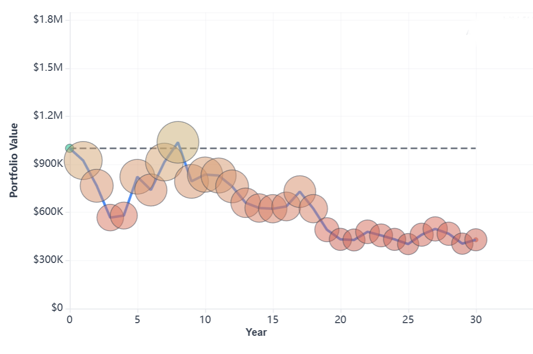
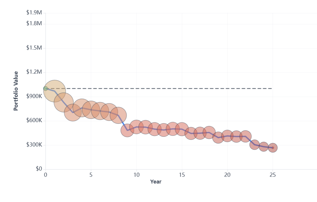
The 1929 portfolio path. Each bubble represents one year's portfolio value (larger bubbles = higher value). Notice the severe crash in years 1-3 (Great Depression), brief recovery to $1M (years 4-8), second crash in 1937 (year 9), then slow decline for 20+ years. The portfolio succeeded and ended at $430K.
Years 1-3 (1929-1932): the crash. Portfolio dropped from $1M to $570,000. Stocks fell dramatically, but the 40% bond allocation provided cushion. Bonds actually gained value during the deflation. Total withdrawals: $135,000.
Years 4-8 (1933-1937): brief recovery. Market surges and the portfolio recovers to $1M. The retiree is now 68 years old assuming they retired at 60. Deflation means the nominal withdrawals are actually lower than the original $45,000.
Year 9 (1937-1938): second crash. Market crashes 50% again. Portfolio drops from $1M to $750K. The psychological impact: when you think the Depression is over you start wondering whether the story will repeat. The war is approaching, too.
Years 10-30 (1939-1959): slow decline. Portfolio grinds downward for two decades. World War II brings inflation. Post-war recovery helps markets. Withdrawals are now over $65K due to inflation. By year 30, roughly $430,000 remains.
The data reveals: the 1929 cohort succeeded by the 30-year definition, despite the financial stress. Historical testing shows that delaying retirement to 1939 (after both crashes) with the same strategy resulted in almost $3 million by 1969. Timing can determine a 7x difference in outcomes.
What the historical record shows about why this cohort survived when it could have failed:
- Bonds saved the day. The 40% bond allocation cushioned the crash. A 100% stock portfolio would have been much more volatile.
- Deflation helped. 1930s deflation actually reduced nominal withdrawals, buying crucial time for recovery.
- 4.5% was close to the limit. A 4.0% withdrawal would have left $850,000+, while 5.0% would have failed at about year 30.
- Success breeds success. Most cohorts starting the years before or after 1929 ended with significant wealth.
1966: the worst year to retire in 150 years
The actual worst case in 150 years. Failed in year 23.
Asked to pick the worst year to retire in the past 150 years and 1966 will not spring to mind. But it was one of the worst choices. Worse than 1929 or 2008. The 1966 retiree experienced complete portfolio depletion by year 22-23 (around 1989-1990), running out of money at approximately age 82, assuming they retired at 60.
What made this time worse than the Great Depression? The toxic combination: stagnant growth, devastating inflation, and no recovery window. The portfolio never recovered while inflation-adjusted withdrawals spiraled ever upward.
| Money ran out | Age at depletion | Worst year | Recovery to $1M |
|---|---|---|---|
| Year 22 | ~82 years | -25% | Never |
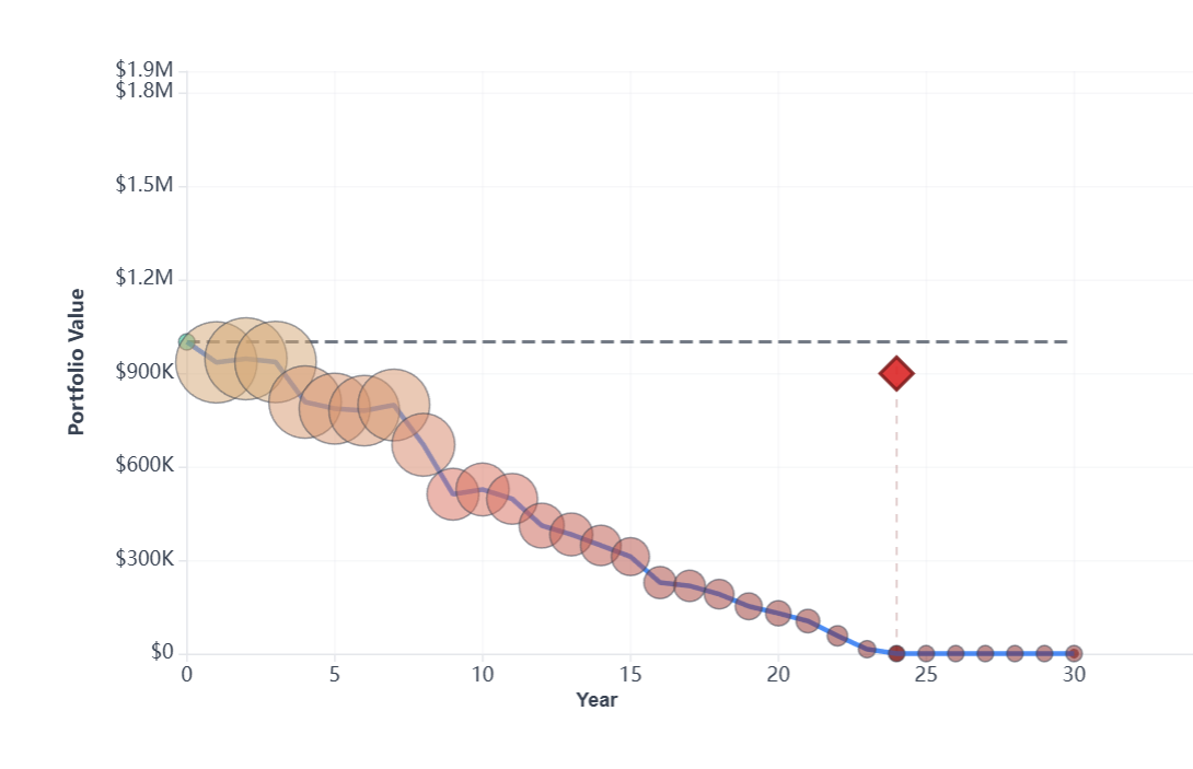
The 1966 collapse. Starting at $1M but experiencing steady erosion through multiple declines (1968-70, 1973-74). The red diamond marks complete portfolio depletion in year 22-23 ($7,000 was left at year 22). The combination of poor returns and high inflation created an unrecoverable spiral.
Years 1-5 (1966-1970): early warning. Market peaks in 1966, then grinds lower. Portfolio drops from $1M to ~$770K despite brief rally in 1967-68. Withdrawals total $225,000 over five years. The situation is already concerning.
Years 7-8 (1973-1974): the knockout. Worst bear market since 1930s. Stocks fall 48%. Inflation hits 12%. Portfolio collapses from $770K to $490K. Annual withdrawal has inflated to over $60,000 just to maintain purchasing power. Now withdrawing 12% of portfolio annually.
Years 10-15 (1975-1982): inflation trap. Markets deliver nominal gains but inflation runs 7-13% annually. Portfolio stuck between $400K-$500K. Each year's withdrawal (now exceeding $75,000 in nominal terms) takes a larger percentage. The great 1982-1987 bull market is coming, but it's too late.
Years 16-24 (1983-1990): terminal phase. The 1980s bull market arrives but can't save this portfolio. Its value is under $300K and shrinking despite market boom. Withdrawals consuming more than returns generate. Around 1989-1990, in one's 80s, money runs out completely.
The timing reality: a 1970 retiree, just 4 years later with identical strategy, ended with over $600K. This is by following the same investment plan. The difference is not retiring when stagflation started. The data shows sequence of returns in the first decade is decisive.
The 1966 portfolio shows extreme sensitivity to small variations:
- $5,000 annual difference. Starting at $39,000 withdrawal instead of $45,000 extended portfolio life past 30 years.
- Spending flexibility impact. 10% cuts when portfolio dropped below thresholds (1973, 1979) extended portfolio life significantly.
- Inflation adjustment pauses. Skipping adjustments in peak inflation years (1974, 1975, 1979-1981) prevented the withdrawal spiral.
1973: the oil crisis peak
Stagflation meets market collapse. Failed in year 30.
The 1973 cohort experienced perhaps the cruelest outcome: they almost made it. The portfolio depleted right around year 30, technically failing by months. Three decades of careful management, only to run out just as they crossed the "safe" threshold.
| Depletion | Missed by | Final decade | Age at failure |
|---|---|---|---|
| Year 30 | Months | High anxiety | ~90 years |
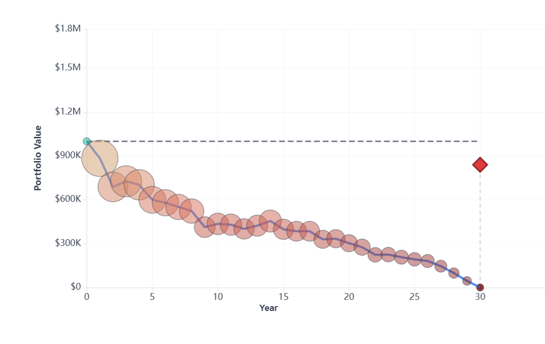
The 1973 near-miss. Immediate crash in years 1-2 (oil crisis), followed by 25+ years of slow erosion. The red diamond at year 30 shows portfolio depletion right at the planning horizon. A technical "failure" by the narrowest possible margin.
Years 1-5 (1973-1977): immediate crisis. Oil embargo. Recession. Watergate. Portfolio crashes from $1M to $660K by 1975. Inflation spikes to 11%. Withdrawal climbs from $45,000 to over $55,000 for same purchasing power. Now withdrawing 9% annually.
Years 5-15 (1977-1987): grinding lower. Portfolio oscillates between $430K-$580K for a decade. Inflation peaks at 13.5% in 1980. Withdrawals forced ever higher. By 1987, age mid-80s with under $400K. The runway is shortening.
Years 15-25 (1987-1997): bull market, but too late. The great 1980s-90s bull market arrives. Portfolio too small, withdrawals too large. Even with strong returns, extracting more than growth replaces. Portfolio declines from $300K toward $180K.
Years 25-30 (1997-2003): the final years. Portfolio below $100K, then below $50K. Year 28 passes... year 29... around year 30, depletion. The strategy "worked" until year 29.
The margin of error: the 1973 cohort reveals how thin the line is between success and failure. They planned for 30 years and lasted 30 years, but with nothing left. As life expectancy increases, a "30-year plan" from age 60 that ends at 90 becomes increasingly risky.
The 1973 failure shows incredibly narrow margins:
- 0.25% withdrawal difference. Starting at 4.25% instead of 4.5% ($42,500 vs $45,000) would provide enough cushion.
- Three-year adjustment. Reducing withdrawals 5% during 1974-1976 extended portfolio past 30 years.
- Minimal additional income. $5,000 annually for 5 years from any source would prevent failure.
- Planning horizon. Building for 35 years instead of 30 would have revealed inadequacy earlier.
2000: the dot-com bubble
Tech crash followed by financial crisis. Surviving after 25 years.
Retiring in 2000 meant facing something perhaps unusual: two major bear markets within your first decade. Dot-com crash (2000-2002): -49%. Brief recovery. Financial crisis (2007-2009): -57%. Yet this cohort survived and maintains approximately $520,000 after 25 years.
| Current value (2025) | Years elapsed | Status | Major crashes |
|---|---|---|---|
| ~$520K | 25 years | Surviving | Two |
The 2000 roller coaster. Sharp decline years 1-2 (dot-com crash), recovery years 3-7, second crash years 8-9 (financial crisis), then recovery aided by the longest bull market in history. After 25 years, the portfolio maintains approximately $520,000 — not the best possible, but safe nevertheless.
Years 1-2 (2000-2002): dot-com crash. NASDAQ collapses 78%. S&P 500 falls 49%. Portfolio drops from $1M to $750K. Two years into retirement, already down 25% (having invested in a mixture of S&P 500 and bonds).
Years 3-7 (2003-2006): recovery period. Markets recover strongly. Portfolio steadies to around $750,000. Age 67, withdrawing around $50,000 annually (inflation-adjusted). Feeling more secure.
Years 8-9 (2007-2009): financial crisis. Lehman collapses. Market falls 57%. Portfolio crashes from $750K to $560K. The psychological impact of a second major crisis at age 69.
Years 10-25 (2010-2025): extended bull run. Longest bull market in history. Portfolio maintains $600K-$700K through 2010s despite withdrawals. COVID crash barely registers (quick recovery). By 2025, at age 85, more than $500,000 remains.
Why 2000 survived but 1966 failed. Both faced severe early crashes. The difference: (1) lower inflation meant withdrawals didn't spiral, (2) the 2009-2020 bull market was extraordinary, (3) crashes recovered within 4-5 years unlike the 10-year stagnation of the 1970s. Recovery speed matters as much as crash severity.
The complete picture: all four journeys
Comparing these cohorts reveals the dominant role of timing and sequence risk:
| Start year | Outcome | Final value | Primary challenge | Key factor |
|---|---|---|---|---|
| 1929 | Survived | ~$430K | 43% wealth destruction | Double crash + long recovery |
| 1966 | Failed year 23 | $0 | Complete depletion | Stagflation + no recovery window |
| 1973 | Failed year 30 | $0 | Ran out at finish | Oil crisis + persistent inflation |
| 2000 | Surviving (25 yrs) | ~$520K | Two bear markets | Fast recoveries + strong 2010s |
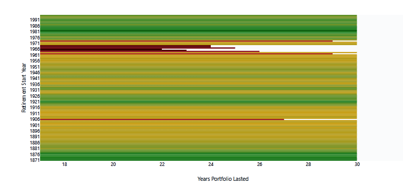
125 years of outcomes: the full heat map
Every 30-year retirement period from 1871-1996 is shown below. Green survived, yellow struggled, red failed:
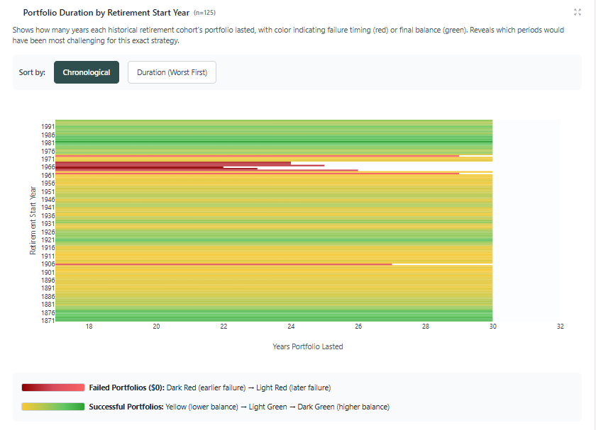
All historical cohorts: portfolio duration by start year. Green bars show very successful cohorts, yellow shows some success, red shows failures. The failure concentration in the 1960s-early 1970s is unmistakable. Of 125 cohorts tested, only 9 failed (7.2%). Notice how the 1960s-70s period shows consistent red/orange while other periods are green.
The pattern: 8 of 9 total failures across 125 years occurred in the 1960s-early 1970s. This represents 90% of all failures in a single 10-year window. The data shows high inflation combined with stagnant markets is more dangerous than dramatic crashes followed by recovery.
Patterns from 150 years of data
These case studies reveal consistent patterns across all historical periods.
1. Most periods worked well
92.8% of all tested cohorts succeeded. The average cohort ended with $1.68 million after 30 years of withdrawals. Failure in this particular historical window was the exception, not the rule.
2. Inflation matters as much as market performance
The 1929 cohort survived an 89% crash partly because of deflation. The 1966 cohort failed with a smaller crash because of inflation.
3. Recovery speed saves portfolios
The 2000 cohort faced two crashes but survived because both recovered within 4-5 years. Quick recoveries (like 2009-2010 and 2020) preserve retirement plans. Extended stagnation (like 1966-1982) destroys them.
4. Small adjustments create big wins
The difference between the failures and successes was often tiny: 0.5% in withdrawal rate, or minor spending flexibility. These aren't lifestyle-changing adjustments but their cumulative effect is to preserve wealth.
5. Starting after crashes works brilliantly
Some of the best retirement years started after market bottoms: 1932, 1942, 1949, 1974, 1982, 2002, 2009. These cohorts often ended with multiples their starting wealth. Bad markets create great opportunities for new retirees.
Run your own analysis: the exact same test
Want to see how YOUR retirement plan performs across these same historical periods? Here's the exact setup we used for this analysis:
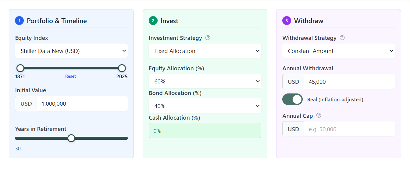
The Bellavia interface. Enter your portfolio value, select your allocation (we used 60% stocks, 40% bonds), set your annual withdrawal ($45,000 in our case), and choose 30 years. The system tests your parameters against all relevant historical periods instantly.
Try your own numbers. Most users are surprised to find their plan is more robust than they thought. You can adjust withdrawal rates, allocation, and timeline to see exactly what changes move you from the "failed" category to the "succeeded" category. Often it's just a 0.5% adjustment.
References & Sources
About this case study. All data comes from Bellavia's historical simulation engine using Robert Shiller's market database (U.S. stocks and bonds, 1871-2025). Base case: $1,000,000 portfolio, 60/40 allocation, $45,000 withdrawal (4.5%), inflation-adjusted. Results represent actual historical outcomes across 125 thirty-year periods.
Discussion (0)
Join the conversation
Log in to commentNo comments yet. Be the first to share your thoughts!